Visual Design & Rapid Prototyping
Code Your Dreams
The Problem:
Code Your Dreams is a Chicago-based nonprofit that values social justice and equal tech opportunities. They provide project-based, student-center classes that enable young people from diverse backgrounds to enter the tech industry. I was tasked to create a new high-fidelity landing page for their site that spoke to fundraising needs.
The Solution:
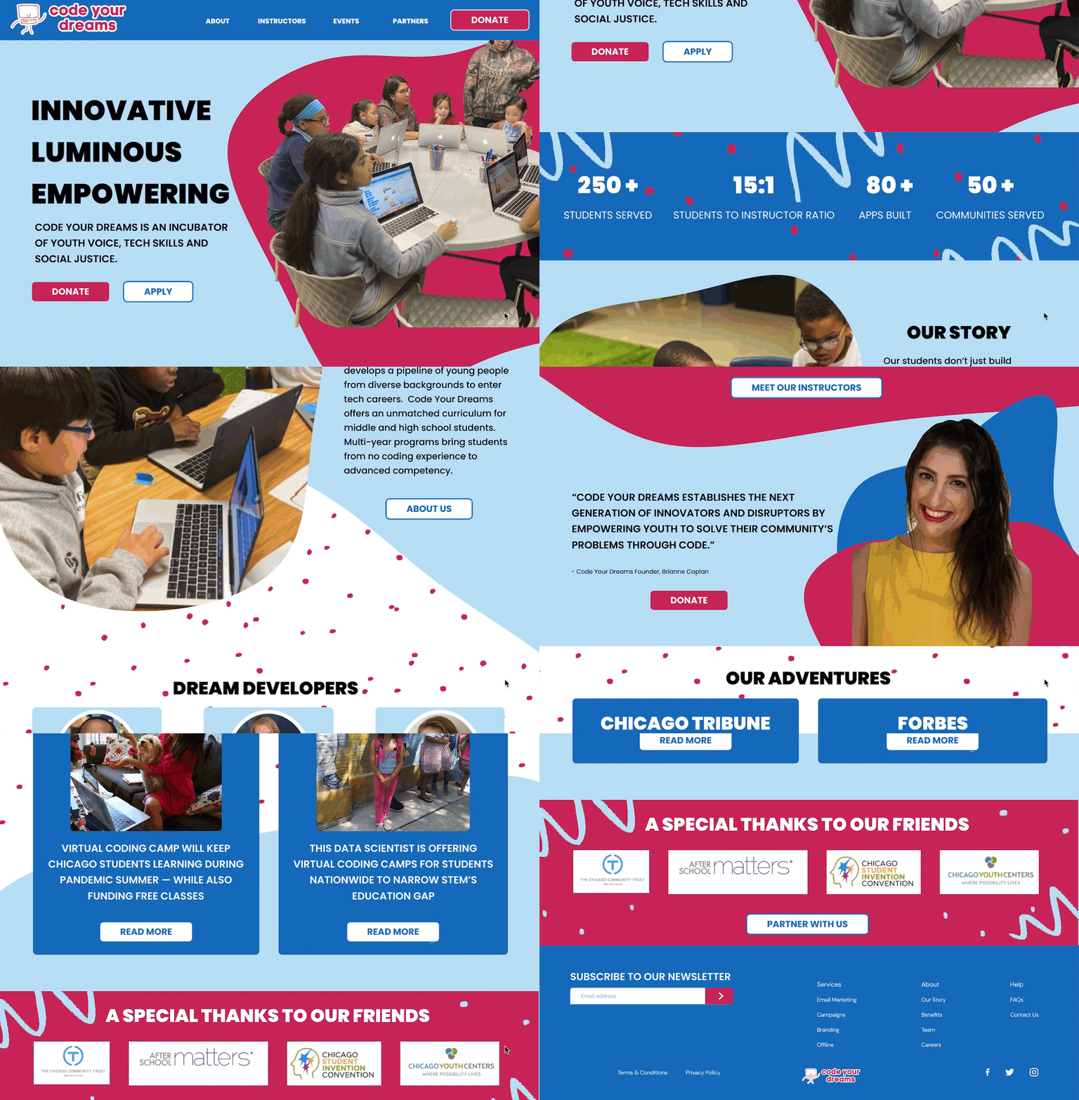
Through speedy research, competitive analysis, storytelling and visual branding, I could create a trendy and informational landing page that encouraged donations.
Role: UI Designer ● Timeframe: 5 days ● Deliverables: High fidelity landing page
Key Methods: UI Design Principles & Rapid Design Sprint
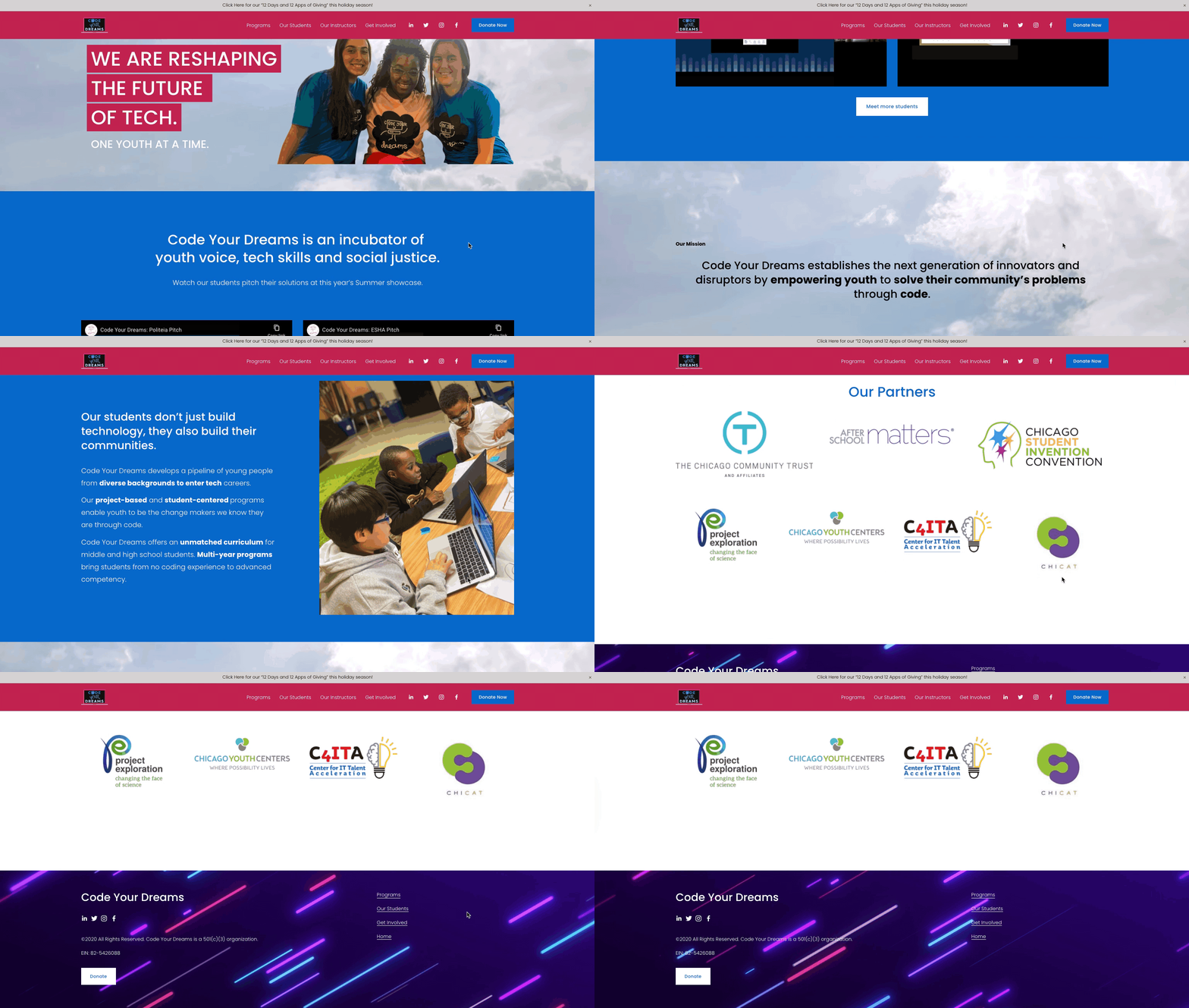
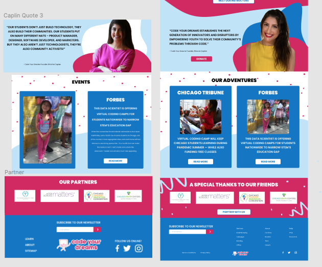
Final Iteration & Original Website
Research
Competitive Analysis
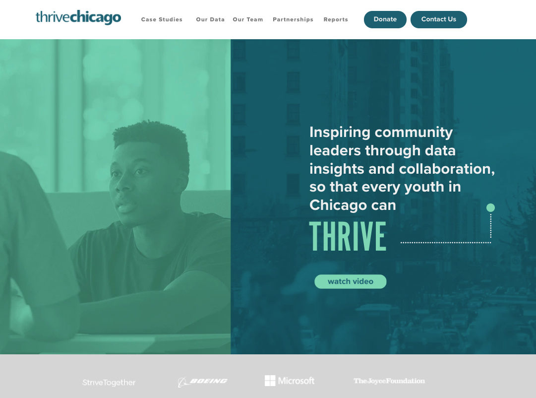
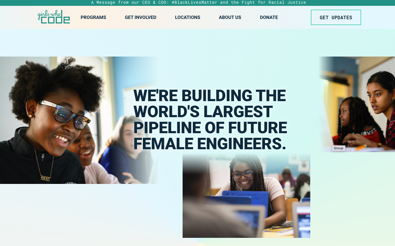
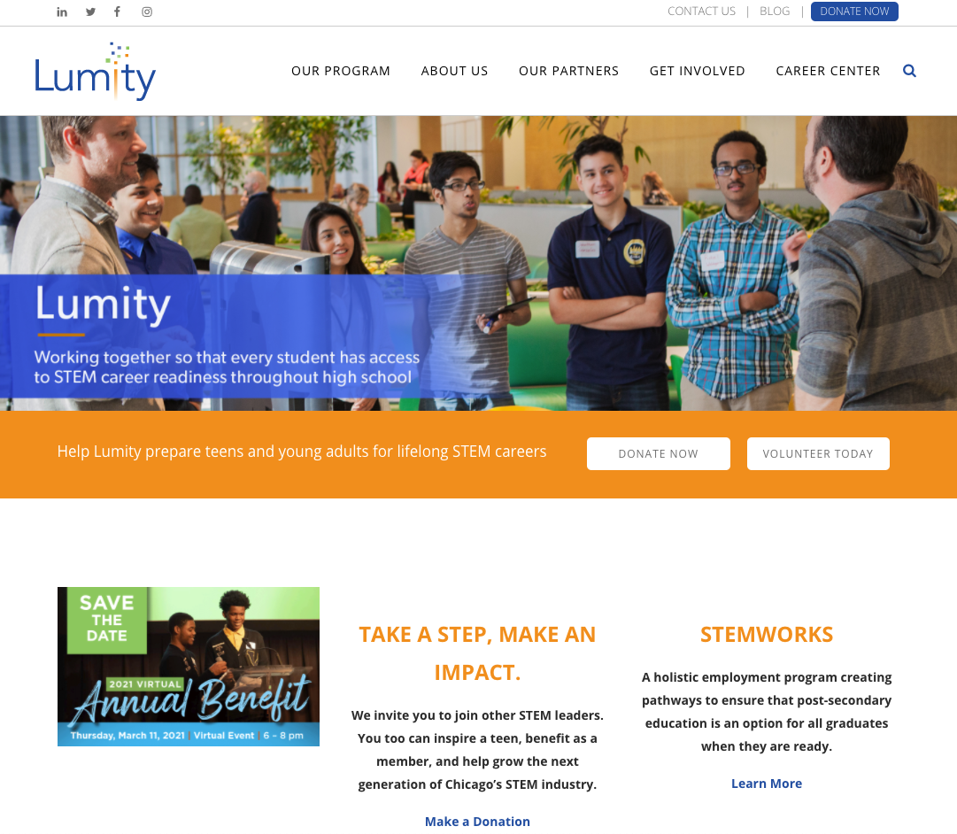
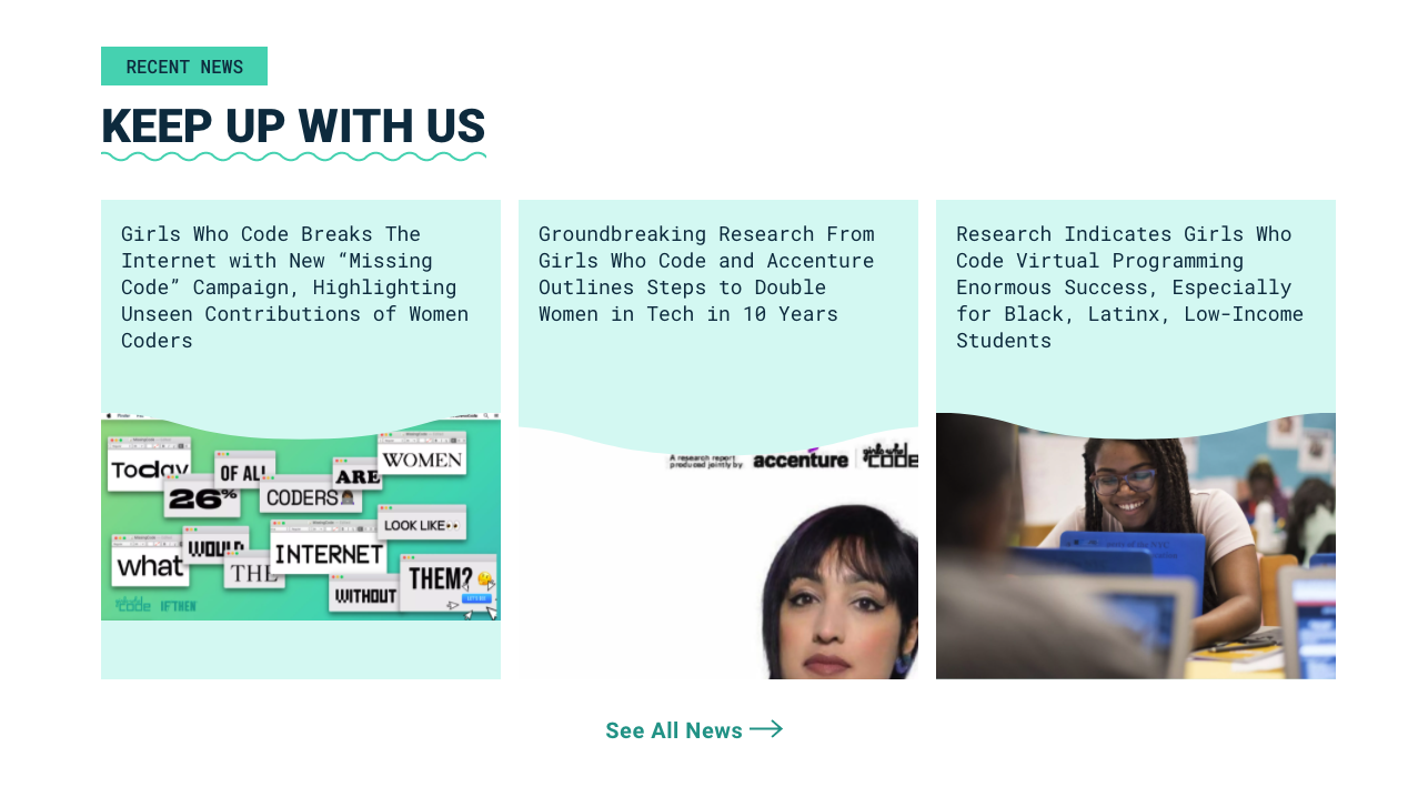
I took inspiration from other nonprofit websites such as Girls Who Code and Chicago-based Lumity for elements in my landing page.
Bright CTA Buttons: The use of colorful, eye-catching calls to action used throughout the page focused on partnernership or donations.
Emotion-provoking imagery: Although I was initially drawn to the idea of using illustrations, I noticed that most charitable organizations online presence had images throughout the site instead. Providing the company with a face, whether it is a partner, owner, or consumer, creates a sense of empathy.
Stats: The use of quick, eye-catching stats at the top of the page is a good way to quantify the brands goals, opportunities, and triumphs.
Partners and News Coverage: Placing images, headlines, and links to outside sources that have partnered with or featured the nonprofit creates trustworthy and credibility to the user.
Sketching
MegaSketch
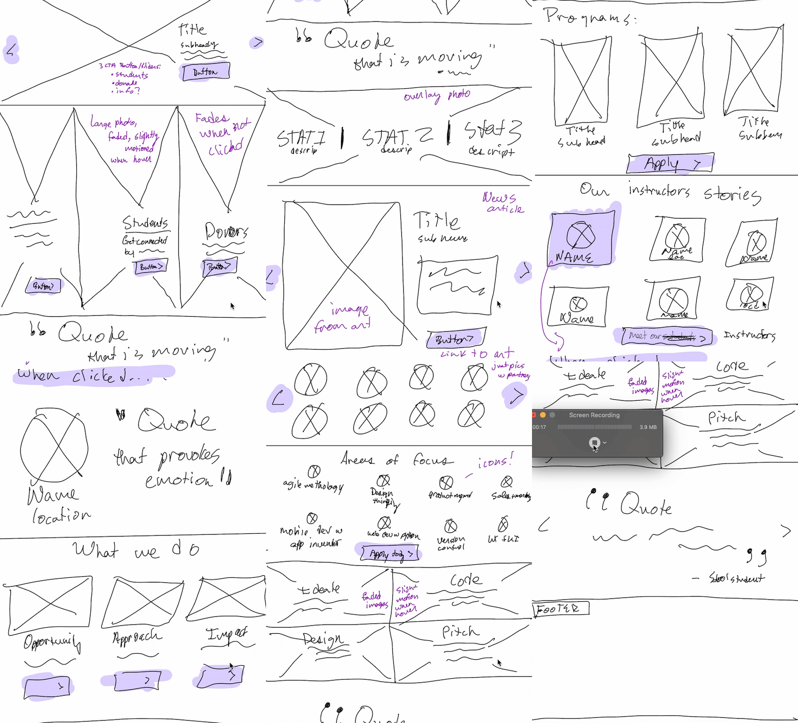
In a rapid design environment, I decided to use a method that I refer as the mega sketch. Typically the first sketch I do when I start a new project, I ignore information architecture and simply sketch every single element I can picture on the page. If I’m considering multiple ways to create a carousel, I sketch them all. I scroll and sketch and scroll and sketch until every idea I have is on paper. After this, I can rearrange and eliminate the elements that work best for the page.
Visual Identity
Style Guide
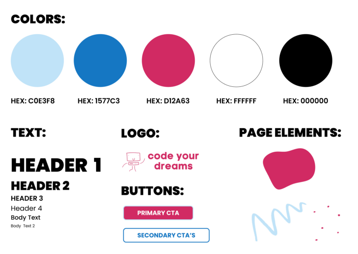
In order to make sure that the Code Your Dreams brand was apparent throughout the site, I decided to make a style guide that I would follow. I decided to stick with the original theme of the website, which was a vibrant pink and lively blue. In the current website, baby blue was used as an accent color. In the new version of the website, I wanted to make it the primary color. It is a bit less intense and also amplifies the dreaminess of the site, while the pink adds a splash of fun.
I also kept the same font, in varied weight and sizes, throughout the website. I ended up choosing 6 different paragraph styles to create contrast throughout the page. Since we were asked to keep this landing page to about 4–6 scrolls, I didn’t want to add too much variety that may create a cluttered feeling. Cohesion was key, and I was really happy with the results!
Rapid Prototyping
Feedback and Iterations
Smooth page transitions: Towards the bottom of the page, the elements felt a little clunky. Since there were smaller sections, the wavy element felt more awkward. I applied my secondary elements, the dots and squiggles, to make it feel more fun and cohesive towards the bottom.
Footer: My initial footer felt unprofessional. I didn’t have enough information down there. I did a competitive analysis of other footers to create a more streamline one.
