Discover Financial Services
Utilizing social validation within design to drive credit card applications
The Hypothesis:
After analyzing consumer insights, my team found that social validation appears to be very important to potential Discover It Student Cash Back credit card applicants. By predominately featuring honest reviews from our current cardholders, we believed there would be an increase in applications.
The Solution:
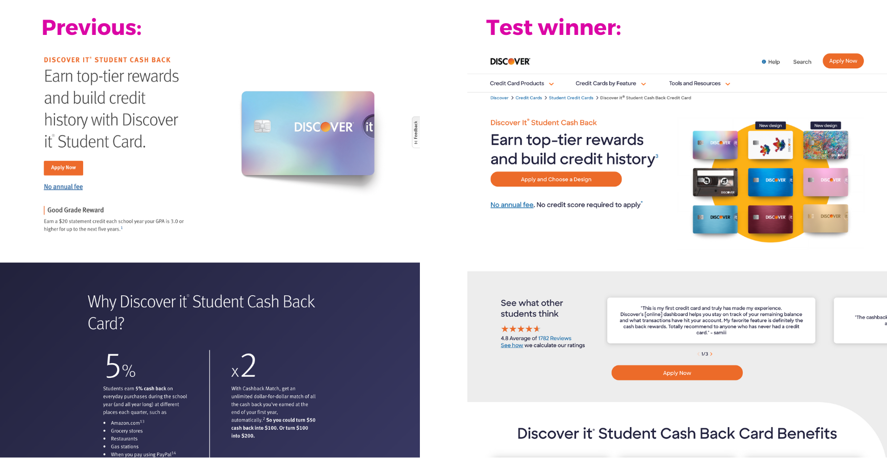
Through competitive analysis, studying user flows, and working with many knowledgable business partners, I created a design to A/B test on our Discover it Student Cash Back page. The reviews are now featured as a sleek, updated component that appeared above the fold (on both mobile and desktop).
The Outcome:
The design won the A/B test with a 6% lift in Discover It Student applications. The design went live on the Discover it Student Cash Back page. This new review section went on to replace our testimonial component across all acquisition pages.
Brand Identity
This test was set to go live during our extensive brand redesign rollout. The rollout entailed recreating all of our 30+ acquisition pages in a new design system. This created a possible pain point for our users, since the pages within one user flow could visually look and feel very different from one another. Because of this, I knew I needed to utilize some of our more classic brand elements to keep a cohesive feeling. I didn’t want to pass up the opportunity to try out some new explorations, though!
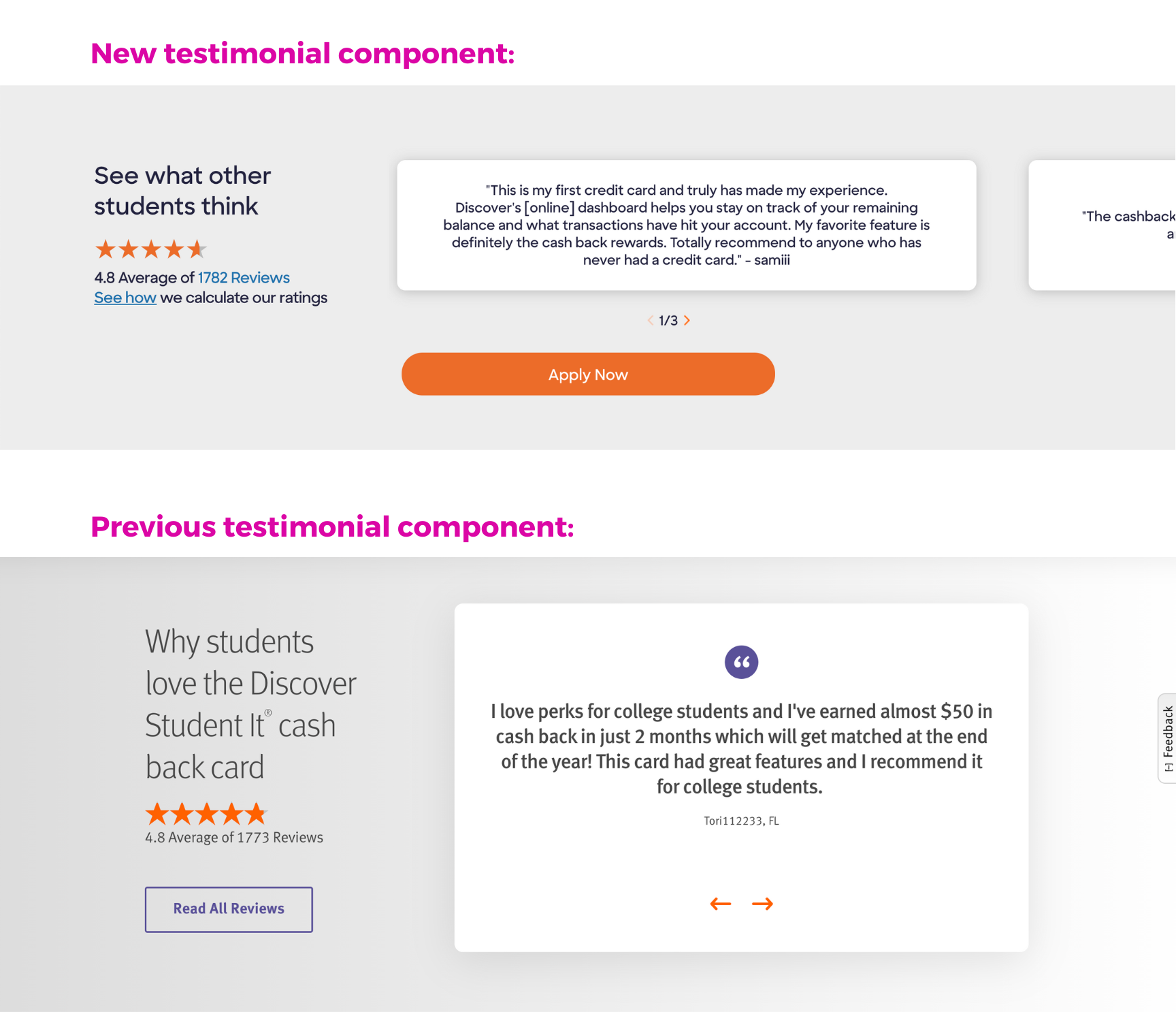
Embracing, but reworking, the drop shadow: The drop shadow lived across many components, on many pages, in our previous design system. I thought it was important to keep this brand element, while updating it to fit into our new, more “flat-feeling” brand rollout. In order to modernize it, I made the drop shadow darker, but much tighter to the tile. Placing it on a solid background, as opposed to a gradient, also made it feel more clean, modern and smooth.
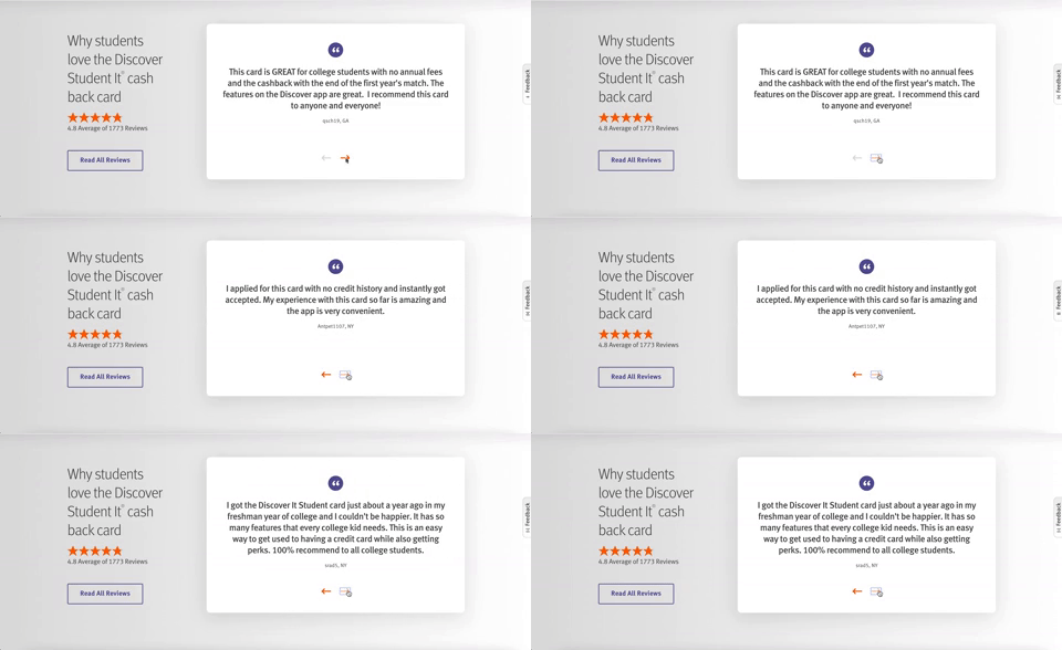
“Peaking” tile feature: Our heat map data showed that the previous testimonial component had little affect on our users. They were typically scrolling through it completely. I took this as a design opportunity. I came to the conclusion that instead of having a single tile shown at a time, adding a “peaking” effect of the next testimonial tile may inspire more curiosity and interaction. After looking at heat maps, click rates, and CTA interactions in the area, we confirmed that it worked! The “peaking tile” affect is now considered a part of our new design system. It was implemented into many components across our pages.
Iterating with Business Partners
Before this test, the testimonial section was the 7th component on the Student it Credit Card page– very close to the bottom. Incorporating these reviews into the tight “before the fold” area meant redesigning everything: the structure, layout, spacing, and toggle preferences. Even when it comes to design changes this (seemingly) small, we had to get multiple approvals through many teams to get this test live.
Unfortunately, I am not able to show iterations of my Discover work that didn’t go live. I went through 12 design iterations, presenting to multiple different stakeholders and teams, to land on a final mockup. I delivered it to our development team via Zeplin and met with our data analytic team weekly to track the A/B testing results.
Winning test
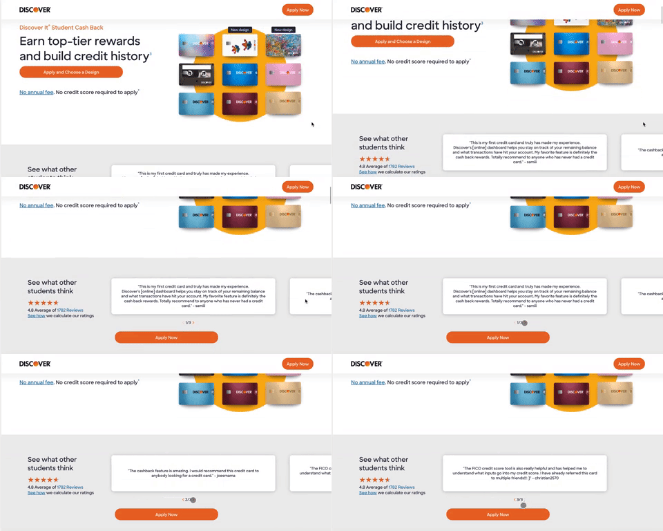
The new student testimonial design update won the A/B test with a 6% lift in student card applications after only 4 weeks. This was a massive win! We ended the test early and the new testimonial component went live on the Discover it Student Cash Back page.

