Discover Financial Services
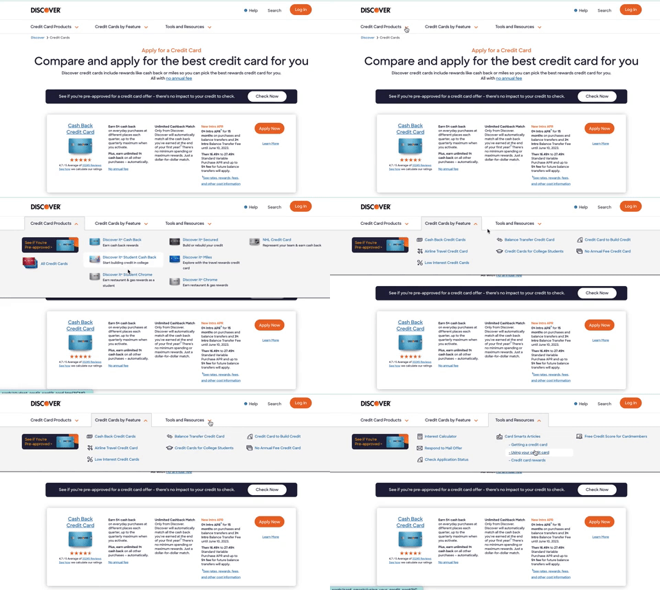
Utilizing competitive research, user testing, and A/B testing to create a new sub-navigation
The Hypothesis:
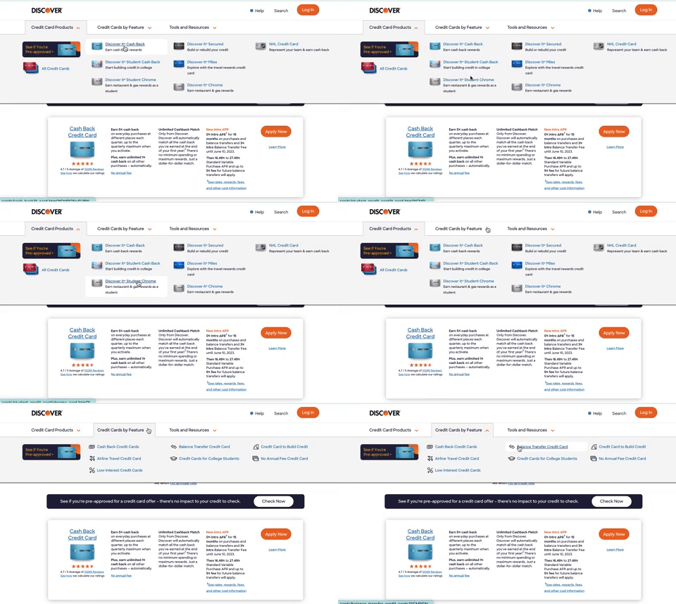
Working in close partnership with the SEO team, we found an opportunity to test into having a sub-navigation. After competitive research, we noticed most credit card companies had a robust sub-navigation and thought this may help our users find the perfect card for them. Especially with the creation of 5 new credit card pages, we hypothesized that a detailed secondary navigation would lead to more page views, application starts, and credit card approvals.
The Solution:
Through competitive analysis, usability testing, information architecture and user flows, our team created an intuitive, sleek secondary navigation that converted browsing users into credit card applicants.
The Outcome:
A winning test that generated a 4% lift in book rate across all credit card acquisition pages. It eventually rolled out to every credit card acquisition page on discover.com.
Research
Competitive Analysis
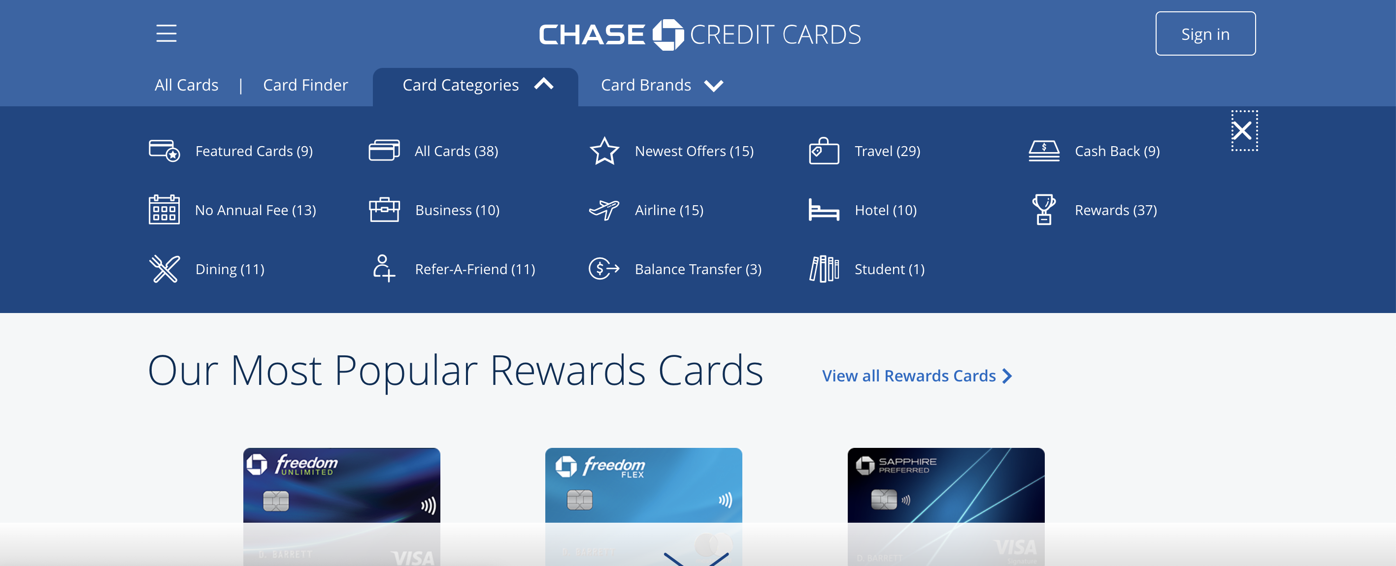
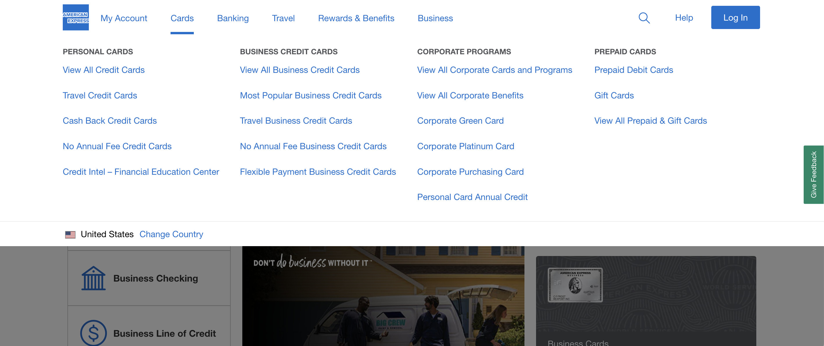
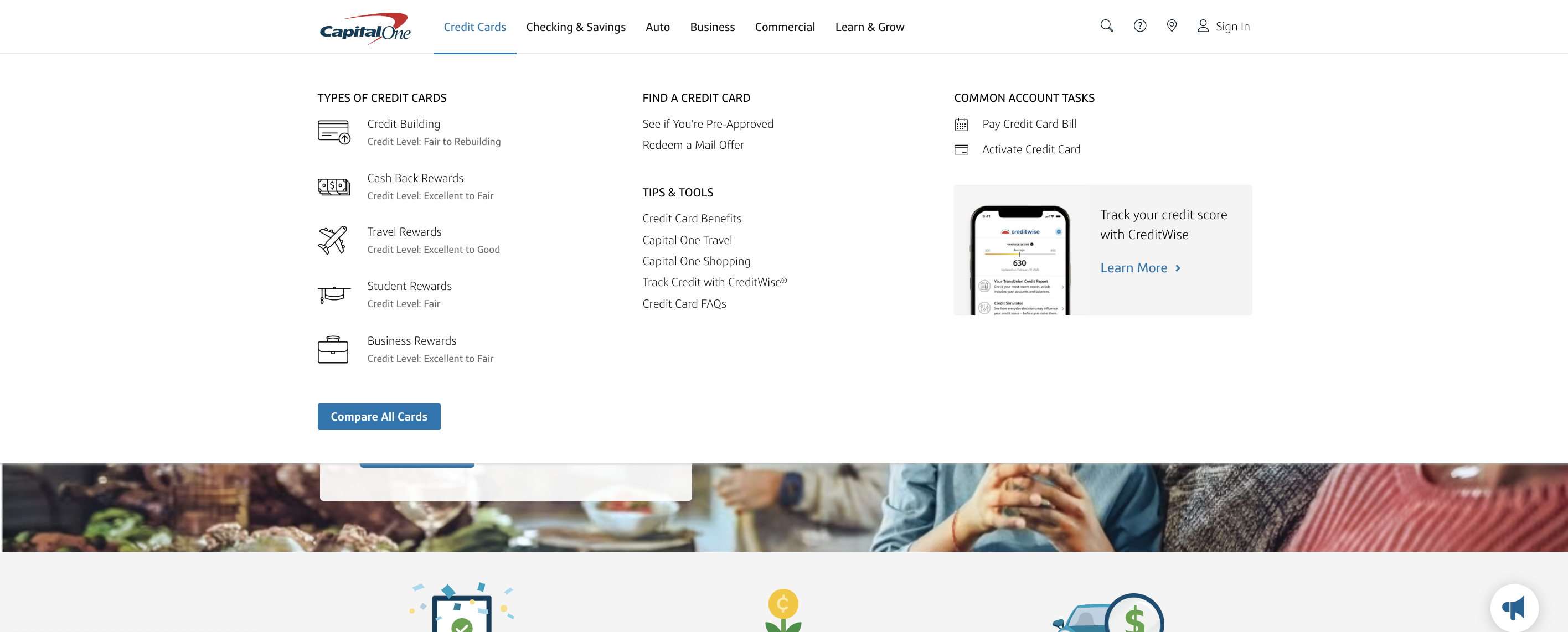
I took inspiration from other credit card websites such as Chase, American Express, and Capitol One. Here are a few design details I kept in mind while creating my wireframes:
Clear, descriptive text: I worked closely with our UX Copywriter to ensure all page titles were worded in a way that was easy for the user to understand.
Creating a grid: In order to keep these secondary menus looking clean, we needed to find a grid that would work consistently across each drop down menu. It was crucial to not let this menu distract from the pages it would live on.
Changing links’ hover state: Giving the user a secondary clue that what they were hovering over was a clickable link was important.
User Testing
Usability testing & card sorting
Menu restructuring: After conducting usability tests, we found that the first iteration turned was extremely confusing for the users. Originally, I had created an wireframe that had 5 separate drop down menus. The users were frustrated by the amount of options they had and ended up hovering over each category a few times before eventually giving up and exiting out of the menu. Through card sorting and multiple usability tests, we finally landed on the current secondary navigation, which has only three drop down options. It took a lot of extra time and many more rounds of reviews, but listening to our users paid off when it won the A/B test!
User interviews
Designing in space for card descriptions: We connected with our Consumer Insights team to learn that a large portion of our audience are users looking for their first credit cards. Keeping this in mind, I worked with our UX writer to create clear, concise descriptions for each product. Focusing on grid and attention to all of the small design details, I could fit the extra content into the dropdown without it becoming cluttered. Confirming via user interviews, we found there was a benefit from including the credit card descriptions. Although it was a lot more additional information, it was important information for our first time credit card users.
UI Iterations
*Unfortunately, I am not permitted to show past iterations of this project with Discover.*
I utilized the the UX application Sketch to create my wireframes, Miro to present iterations to stakeholders, and Zeplin to deliver the final mockups to the development team.
Since this was a new menu that would live on every card acquisition page, we had a long process of feedback and approvals. I presented the updates and new mockups to stakeholders every week. I spent over 9 months iterating new versions until we landed on the prototype that was created for an A/B test.
A/B Test Results
The secondary navigation was declared the winner within 6 weeks of testing. Working closely with our data analytics team, we tracked that the new secondary navigation generated a 4% lift in book rate across all credit card acquisition pages.
You can see the live menu across the pages by exploring on and of the pages within card acquisition HERE.


