User Research, Wireframing, & Prototyping
ShareMyJourney
The Problem:
ShareMyJourney users are not converting at higher rates because they are confused about what is specifically provided with a subscription.
The Solution:
Deliver a clear, efficient, and trustworthy way for users to understand what ShareMyJourney does.
Role: UX Designer & Project Manager ● Timeframe: 2 weeks ● Deliverables: High fidelity Home, About, and Spotlight Pages
Key Methods: UX Research, Usability Tests, Sketches, Wireframes, Prototyping
Final Iterations

User Research
Interviews
We conducted nine interviews with females aged 24–64. We focused on questions such as:
- “How do you normally find guidance with things in life that you are unfamiliar with? (big changes, transitions, traumatic events)”
- “What are your reservations around opening up emotionally to someone you are matched with online?”
- “What do you think the advantage of real life stories is over professional advice?”
Contextual Inquiry
We conducted seven contextual interviews with people searching through the current ShareMyJourney website. Issues with trust, clarity, community, and personal matching.
Sketching
Design Studio
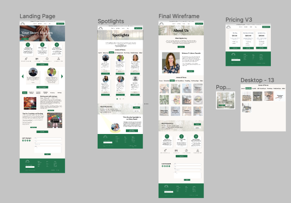
We decided to focus on redesigning three webpages on ShareMyJourney with these goals at the forefront:
- Homepage: focus on providing clarity of the purpose and goals of ShareMyJourney
- About Us: building off of the homepage, we aimed to create more clarity and trust with the user
- Spotlights: to build authentic trust with member testimonials and amplify the community feel.
We conducted a design studio for each of these pages with 2–4 iterations of each.


Wireframes
Iterations
- Brand Guidelines: making sure text sizing, alignment, and color changes were cohesive with our new style guide.
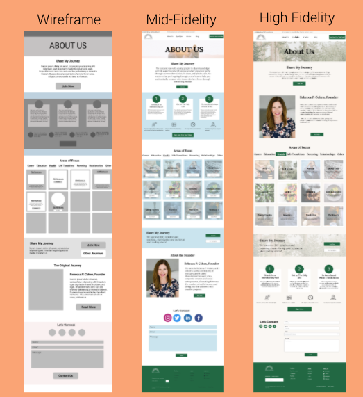
- Information Architecture: I rearranged elements based on what my users journey was while scrolling through the page. The biggest change here was adding the information about the founder closer to the top of the page. Rebecca’s photo and information provided a friendly and welcoming face to the brand. This was more important than ushering users to sign up right away.
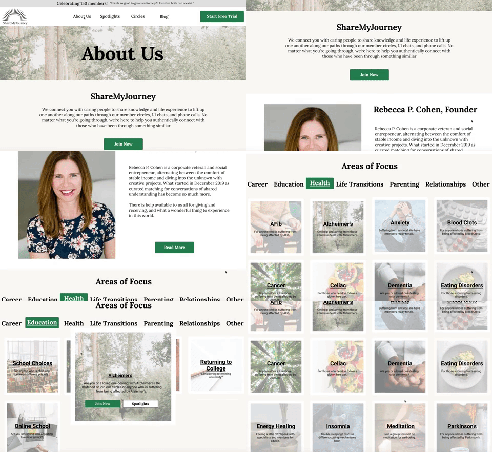
- Clickable Areas of Focus: Through user testing I noticed most people did not realize that the areas of focus changed if clicked. I fixed this by creating an accent background and bolded text on the selected area of focus, enticing the user to click the other elements. This customization of the page proved to test extremely well. Visitors were encourage to create their own journey through the webpage, further inspiring a welcoming feel and encouraging them to share their journey as well.
- Visual Design of Cards: I originally created six different versions of cards. Once committing to one format, I tested the best way to convey all of the information. Having too many buttons (as seen in my mid-fi prototype) confused the viewer. In my final iteration, clicking on a card creates a pop up with more information and links to other pages instead of cluttering one screen with so many CTA’s.
- Contact Form: I focused on making this more updated and sleek through each iteration.


